
About the Company:
Coccinellidae Co. specializes in Internet-based puzzles, scavenger hunts, and interactive games. Coccinelidae is the Latin word for "ladybug". As a start-up, I had the opportunity to brand the company from the ground up.
Method:
The company wanted a logo to reflect both their name and the mysterious nature of the organization. The bug was required to be serious, which is difficult for a ladybug to do when so many end up cutesy and feminine rather than austere and enigmatic. I went with a geometric design punctuated by circles for the spots and eyes and rounded edges and ends for a balance of sharp and smooth. Encapsulated within a circle, the bug includes the name of the company and the "established in" date. The type was chosen based on its angular, geometric features which echo the design of the ladybug icon.

Coccinellidae Co. logo.
Continuing the brand to the collateral, I chose to extend the mysterious context of the company into the print media. The business card design incorporates six different colors, the key colors to the brand. The color sits transparently atop vintage black and white photographs, depicting mysterious circumstances. Abandoned buildings, people rushing by in a blur, train wrecks, and many more images are used for their cryptic aura. Below you see business cards in an unusual 2.75" x 1.10" size, about half the height of typical business cards. This enhances the uniqueness of the brand. In addition to the unusual size, the cards will be printed in an unusual way. Twelve different designs, six in each color (half of which are shown below), will be featured on the cards. The reverse, with the contact information for the company, will remain standard on each card. Pinback buttons in each of the colors are also depicted below, to be made in case the company decides to start a Kickstarter campaign, for which they would be rewards.

Business cards and pinback buttons.
Another concept for a Kickstarter campaign reward, the postcards pictured below were designed to do the same thing the business cards do visually but on a larger scale. The six colors are again featured, as well as the 12 different designs, two for each color (again, only half are shown here). The reverse of the postcard is the standard postcard design (not pictured).

Coccinellidae Co. postcards.
Pulling down the angled motif from the business card and postcard, the letterhead's intent is to appear to be an official document.
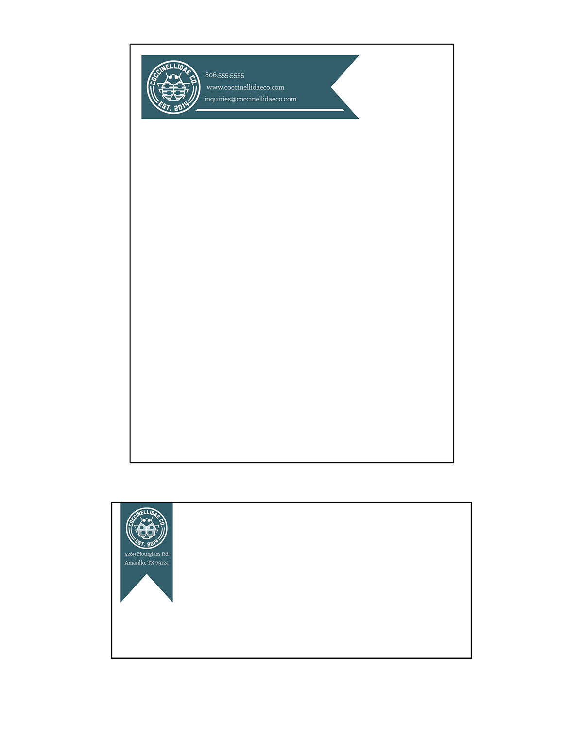
Stationery designs.
The final piece, a poster, builds even further upon the previous designs. Again incorporating the transparent color over black and white imagery, the poster also manages to feature the logo, a QR code, and the angled design used in the other collateral.

Poster.
Conclusion:
This was an extremely enjoyable exercise in identity design. The logo ended up quite nice. It is appropriate, fitting for the mysterious aura desired by the company. It is adaptable, working well at large and small sizes, and on light or dark backgrounds. The elements used to design the collateral are simple enough to transfer easily to other media, but also distinct enough to be recognizable as Coccinellidae Co. Success.


